Zestful Roasters Website Design
Design of a new coffee brand and responsive website that is user friendly, provides clear navigation, offers advanced sorting methods, coffee education, and effective community outreach.
Process
"Research, ideate, prototype, test, repeat" encapsulates my process: understanding the problem through research, ideation during rapid visualization, exploring solutions via prototyping, gathering user feedback through testing, and refining through iterative cycles.
The problem
Create a web presence for a new coffee cafe/roaster that reflects its atmosphere and quality. The new responsive website must drive online sales of coffee, subscriptions, and community engagement while prioritizing education about coffee, brewing methods, and flavor profiles.
My role
Lead UX designer, UI designer, UX researcher, Brand designer, Graphic designer, Product designer, and Technical writer.
Guerilla research
Early in the research process, questions were posed to café patrons concerning information retrieval, website navigation, checkout procedures, and community engagement. The insights gleaned from these inquiries played a pivotal role in shaping the development of the paper wireframes and website.
Competitive analysis
Numerous craft roasters boast excellent products. In conducting competitive analysis, these companies were scrutinized to identify their distinctive market positioning.
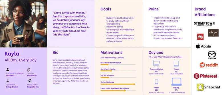
Exploring user empathy
Understanding, compassion, insight, perspective, connection, emotions, motivations, needs, desires, experiences, context, challenges, and communication.
Site map
To start the design and build on user empathy a site map was created to help guide the initial sketch and digital wireframes. The chosen structure prioritizes simplicity and ease of use.
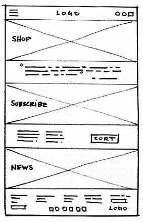
Responsive Paper and Lo-Fi wireframes
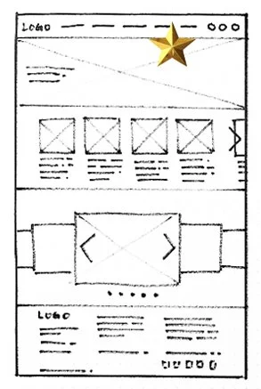
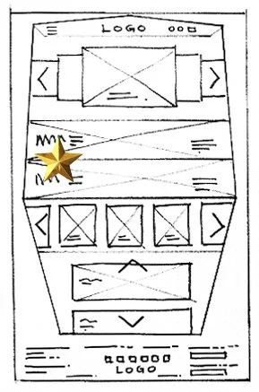
Initial concepts, sketches, layout drafts, basic visual representations, exploration, ideation, simplicity, flexibility.
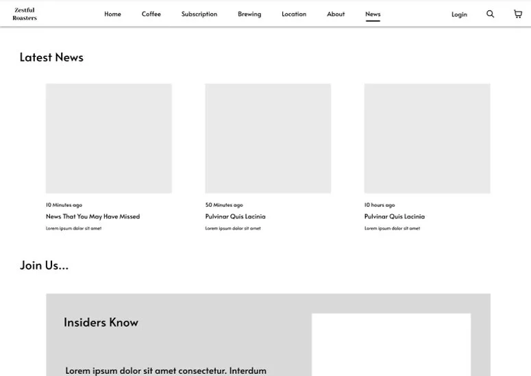
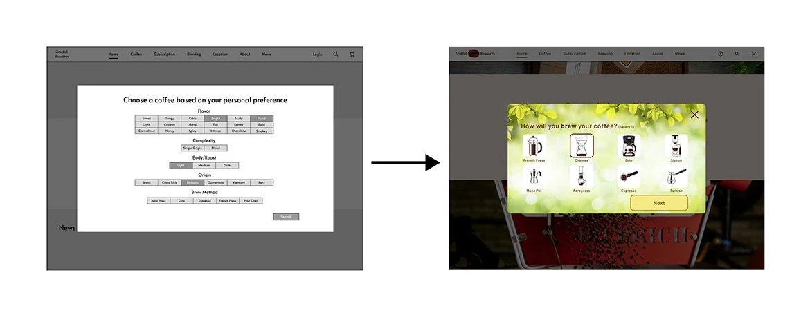
The development of pre-sorted products and customizable sorting options was prompted by user research findings. Similarly, a chronological news/blog/community section has been implemented to enable users to effortlessly keep track of updates regarding their favorite roaster.
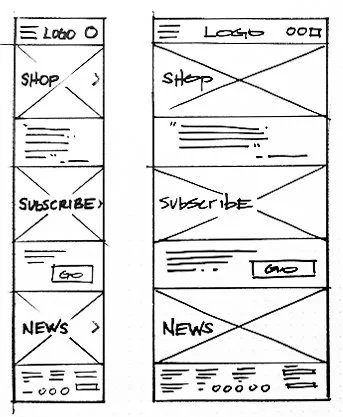
A quick responsive design study was conducted to guarantee that the layout and functionality seamlessly adapt to diverse screen sizes, ensuring optimal user experience across various devices. This study aimed to assess the design's ability to maintain consistency and usability, regardless of the screen dimensions, thereby enhancing accessibility and user satisfaction.
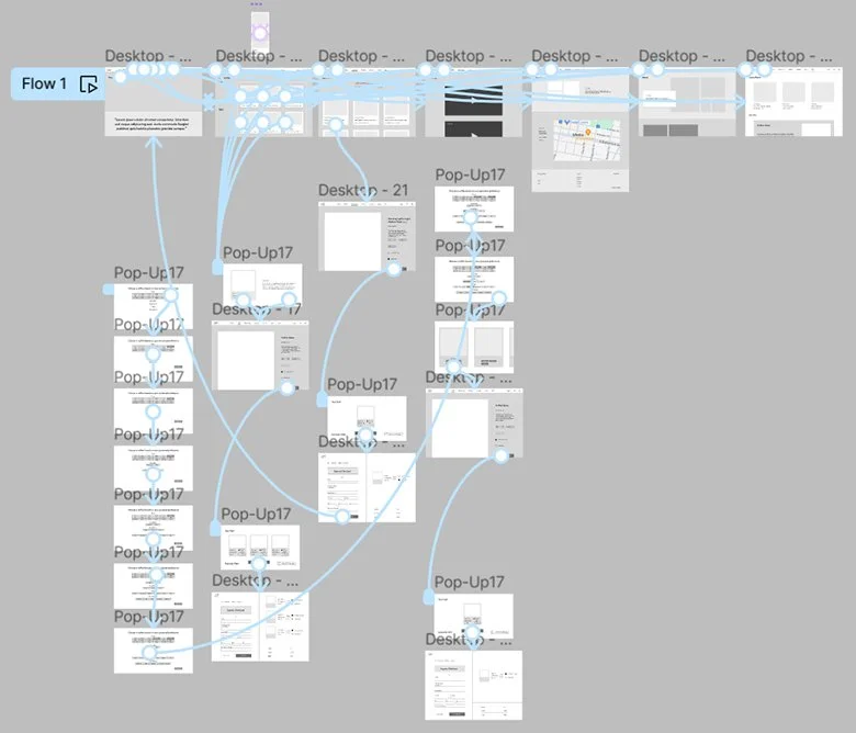
Lo-Fi prototype
Rough outlines, basic representations, early-stage models, initial concepts, user feedback, iterative development, preliminary design.
Usability study
Comprehensive, insightful, iterative, user-centric, informative, evaluative, analytical, interactive, systematic, thorough, empirical, diagnostic, user-focused, detailed, effective.
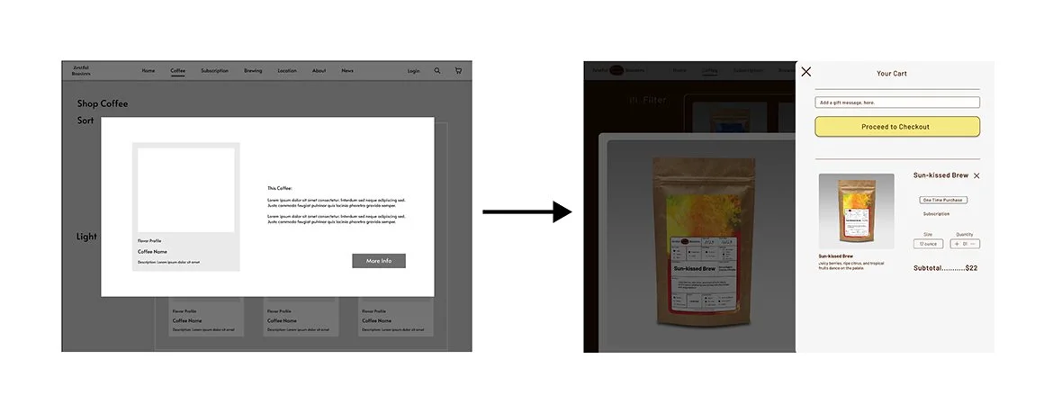
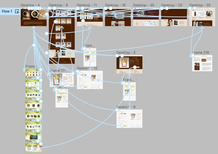
Five users participated in a remote usability study. Three issues were identified: Product sorting experienced navigation issues; users disengaged, suggesting enhancements for improved engagement and functionality. Functionality gaps found with the checkout sequence: Users found it difficult to cancel out of the process once it was started. And users faced navigation hurdles with hero image links on the homepage, unaware of clickable access to shopping, subscriptions, and news. The high-fidelity prototype has been updated to incorporate the latest changes, ensuring an accurate reflection of the design's current state. This revision process involved fine-tuning various elements to align with the project's evolving requirements and user feedback.
Full-size mock-up
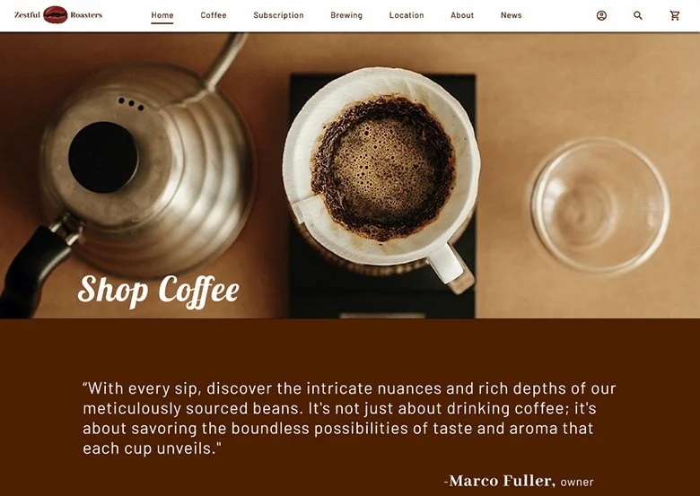
The final design solution is getting near, these images helped solidify the final design direction. Subsequent pages will adopt a congruent design aesthetic, incorporating patterns, typography, color schemes, and layout.
Responsive design mock-ups
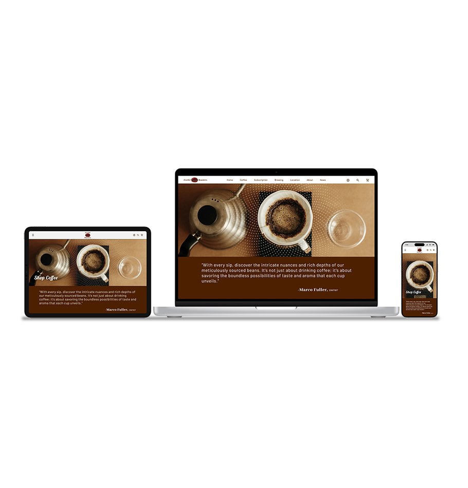
The final design solution is confirmed to be adaptable for smaller screen sizes, tailored for iPhone 14/15 Pro and iPad Pro 11".
Hi-Fi prototype
Extensive, perceptive, iterative, user-oriented, informative, evaluative, analytical, interactive, methodical, meticulous, empirical, diagnostic, user-centric, detailed, efficient.
Accessibility considerations
1. Proper Heading Structure: Used proper heading hierarchy (h1, h2, h3, etc.) to structure content logically. Screen reader users navigate through web pages using headings, so this helps them understand the organization of content.
2. Keyboard Accessibility: Ensured that all functionalities can be operated using a keyboard alone without requiring a mouse. This includes navigation, form filling, and interactive elements.
3. Alternative Text for Images: Provide descriptive alternative text for all images to convey their content and purpose to users who cannot see them. This is important for users relying on screen readers.
4. Color Contrast: Maintained sufficient color contrast between text and background to make content readable for users with visual impairments or color blindness. WebAIM's Contrast Checker was utilized to confirm compliance with accessibility standards.
5. HTML markup: Utilized to ensure content was well-structured and understandable by screen readers and other assistive technology.
6. Consistent Navigation: Kept navigation consistent across pages to help users understand and predict where they can find certain elements on the website.
7. Avoiding Auto-Play: Avoided auto playing audio and video content, as it can be disorienting for users and interfere with screen reader users' ability to navigate the site.
Next steps
1. User Testing: Conducting usability testing with real users to gather feedback on the functionality, usability, and overall user experience of the mock-up.
2. Iterative Refinement: Using the feedback obtained from user testing to refine and improve the design, addressing any issues or areas for enhancement identified during testing.
3. Responsive Design: Ensuring website design responsiveness and optimization across desktops, tablets, and smartphones is essential. This guarantees enhanced user experience and accessibility, accommodating different browsing habits.
4. Finalization: Finalizing the design and preparing it for development, including creating design specifications and assets for the development team to use during implementation.
5. Collaboration with Developers: Working closely with developers to ensure that the design is implemented accurately and efficiently, addressing any technical considerations that may arise during development.
6. Launch Preparation: Planning and coordinating the launch of the website, including tasks such as domain registration, hosting setup, and deployment to production servers.
7. Accessibility Audit: Conduct an audit to ensure that the design complies with accessibility standards. Make necessary adjustments to ensure that the website is accessible to users with disabilities.
2. What I Learned: The website I developed prioritized simple navigation, appealing design, and content accessible to all, resulting in increased user satisfaction and engagement. It provided me with an opportunity to learn a new computer program and design process. The project received praise for its fresh and creative approach, demonstrating the effectiveness of integrating user-friendly design principles with modern technology. This experience not only enhanced my skills but also highlighted the importance of prioritizing inclusivity and user experience in web development.
Takeaways
1. Impact: The website I crafted had a positive impact on user experience. By thoughtfully refining elements like navigation, design, and accessibility, it elevated user satisfaction and fostered greater user interaction. This led to a noticeable improvement in user engagement, indicating a significant enhancement in digital interaction overall.

